Жовта Лампа (Yellow Lamp) is an online platform designed to help users find and connect with qualified psychotherapists. The platform focuses on ease of use, providing users with a seamless experience when searching for a therapist that suits their needs. As the UI/UX designer, I was responsible for conducting market research, creating the brand identity, designing the website, and developing the UI Kit for future use and scalability.

Challenges & Tasks
Competitor Research and Analysis: Before designing, I conducted an in-depth analysis of competitors in the mental health and therapy platform industry. The key focus was on identifying gaps in user experience and visual identity, especially those that could make “Yellow Lamp” stand out as approachable and comforting for users looking for mental health support.
Brand Identity Creation
The identity of the platform needed to evoke warmth, safety, and trust while being visually distinct. For this, I decided to center the branding around the color yellow. Why yellow? Yellow is associated with positivity, warmth, and energy, all crucial emotional triggers for people seeking psychological support. It symbolizes light, which connects perfectly with the concept of the “lamp,” a beacon that guides individuals toward mental clarity and relief.
Logo Design: The logo is a stylized wordmark of “Жовта Лампа” without an accompanying icon. Why no icon? We wanted to maintain simplicity and clarity, aligning with the calm and supportive nature of the platform. The wordmark was slightly stylized to reflect approachability, while an additional icon could distract from the platform’s main mission of emotional comfort.
Web Design
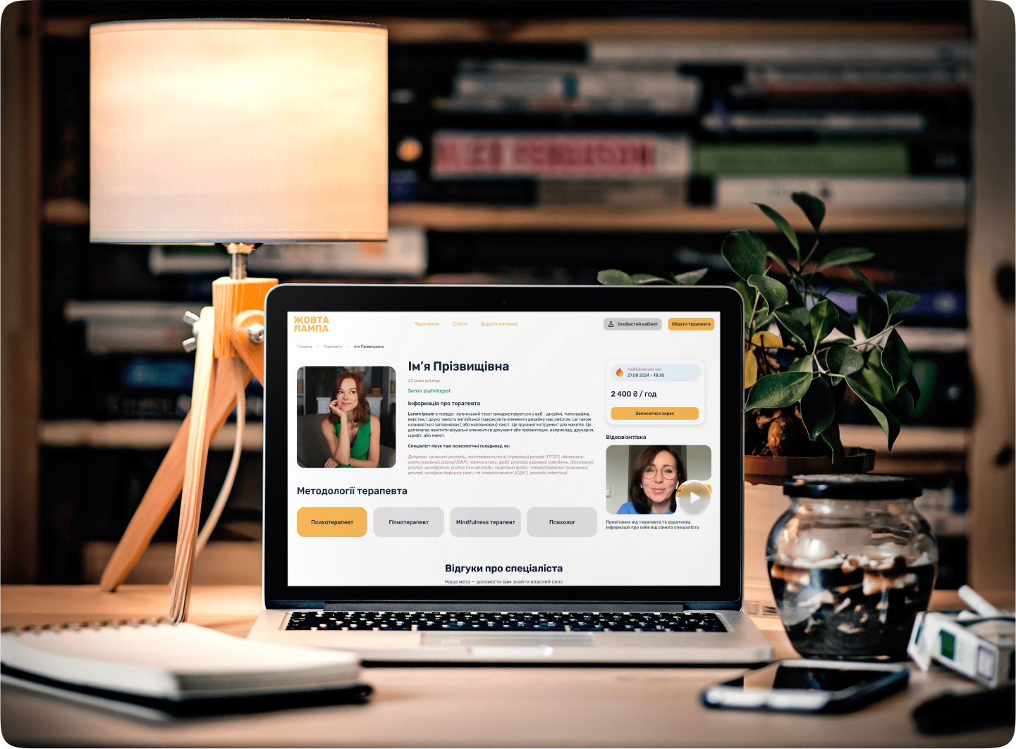
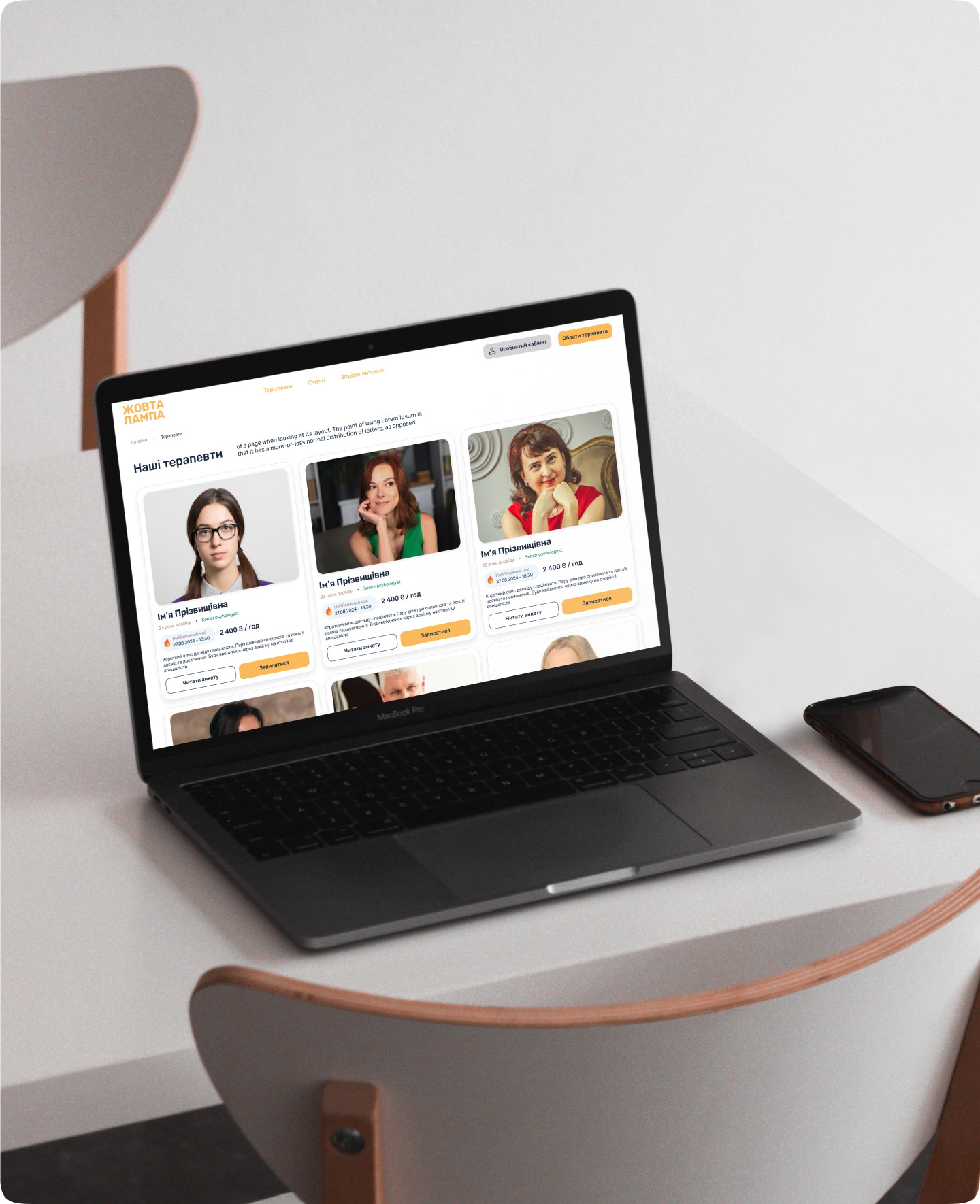
I designed a total of 8 key pages, including the homepage, therapist search, therapist profile, sign-up/login pages, and a FAQ section.
The design was based on simplicity and ease of navigation. Users could quickly find and filter therapists based on specialties, availability, and location, creating a frictionless experience from search to booking.
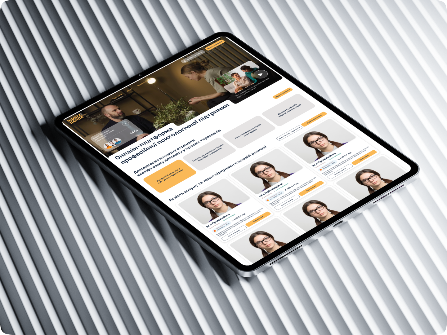
Mobile Adaptation: With a mobile-first approach, I also created a responsive design that ensures users can access all the features conveniently on any device. The mobile version maintains the visual integrity of the desktop design, with optimal usability for on-the-go browsing.
UI Kit Development: I developed a complete UI Kit in Figma to ensure consistency across the platform as it evolves. This included typographic scales, color systems, button styles, input fields, and form elements, all built around the yellow-centered branding.
Results
The final product was a user-friendly, inviting platform that stands out in a crowded market of mental health services. The yellow branding contributed significantly to creating a positive emotional connection with users, while the minimalist logo allowed the platform’s purpose to shine through without visual noise.
Through comprehensive research and careful design, “Yellow Lamp” now serves as a reliable, approachable platform for users seeking mental health services.
This case study showcases a well-rounded process, from research to design execution, and highlights how thoughtful design choices can create both a functional and emotionally resonant user experience.